Below are select projects from my time at Big Fish Games. On each project, I was the sole designer unless otherwise noted.
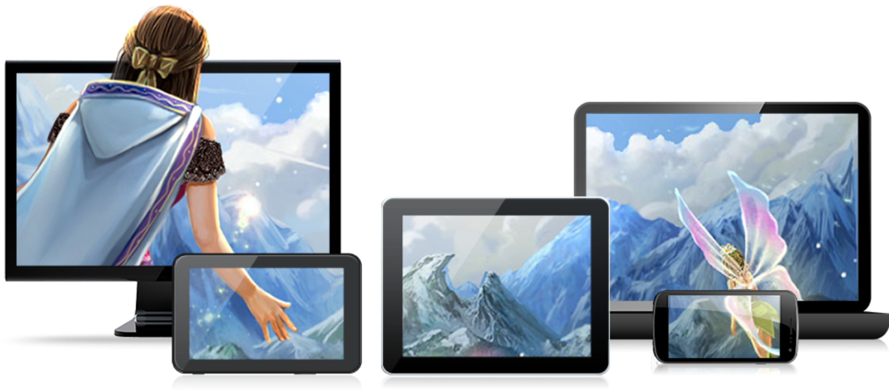
In 2011-2012, founder Paul Thelen was inspired by the likes of Steam, GOG, Gaikai and EA – successful streaming game platforms that were taking the market by storm. With the intent to be forward thinking, Paul set out to disrupt the downloadable game industry to enable Big Fish to quickly reach new customers on new devices and in new territories.
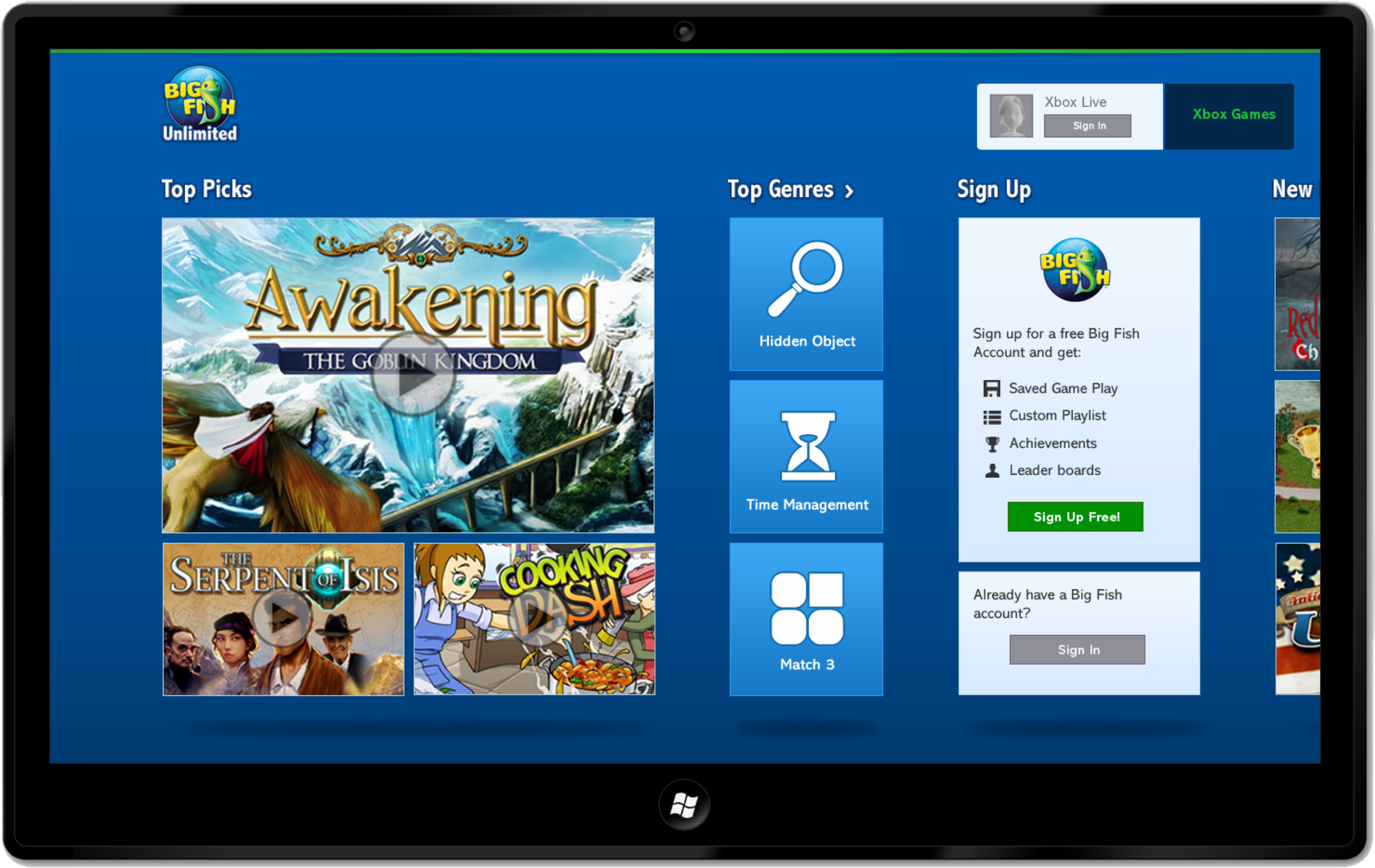
Big Fish Unlimited on Microsoft Surface
The design of Big Fish Unlimited on the Surface was happening before the official release of the Surface itself. Using early versions of the tablets provided by Microsoft, we were able to get a feel for the pilot apps that were pre-installed on them. But the biggest challenge of all was designing a UI that was supposed to adhere to a strict design language – Windows 8 Metro – that was still a work in progress with limited documentation.
It was invaluable to the project to have a Technical Project Manager, whom I worked closely with, acting as the liaison between the Big Fish product team and Microsoft development team.
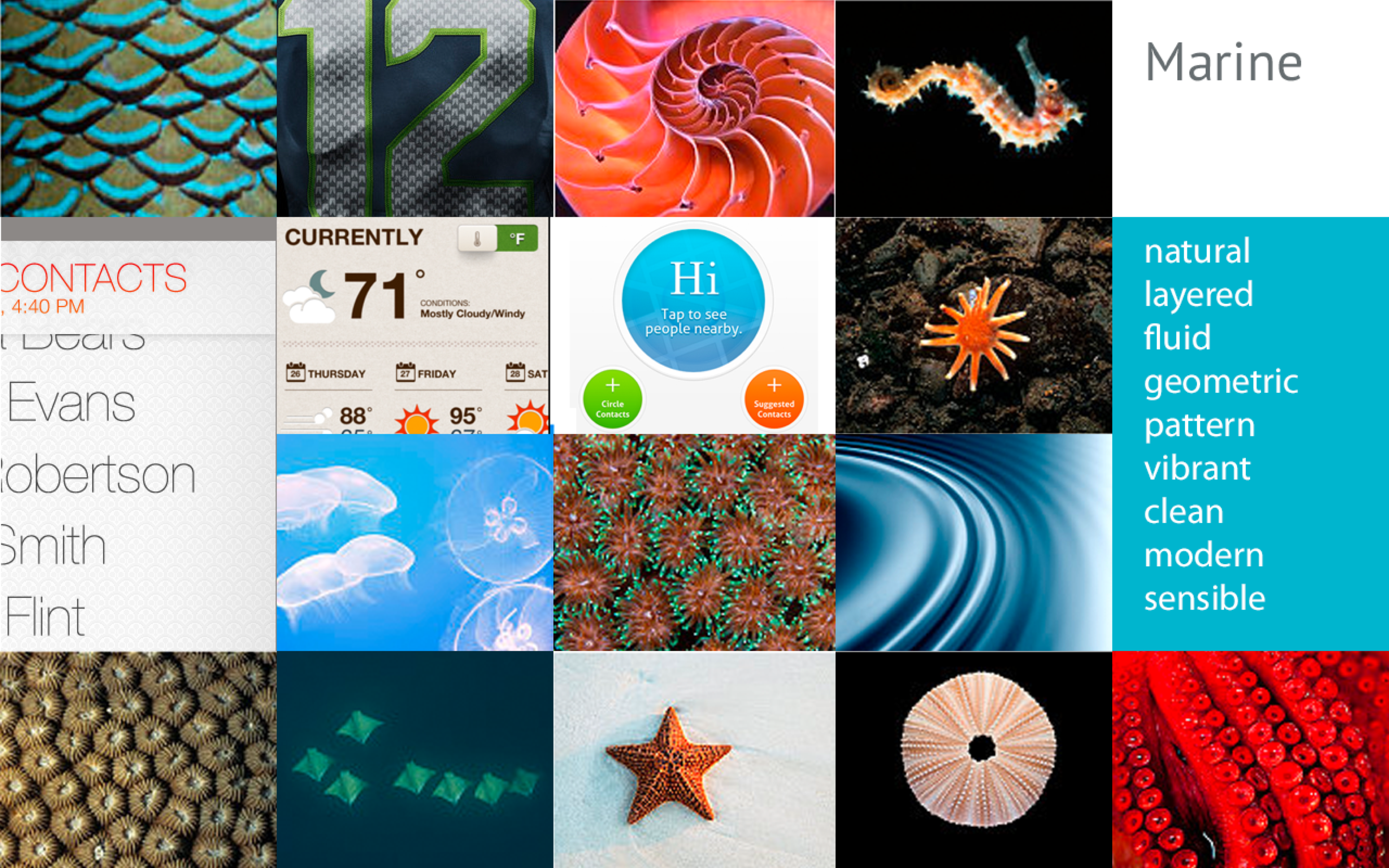
Mood board exploration that set the tone for the look and feel of the app.
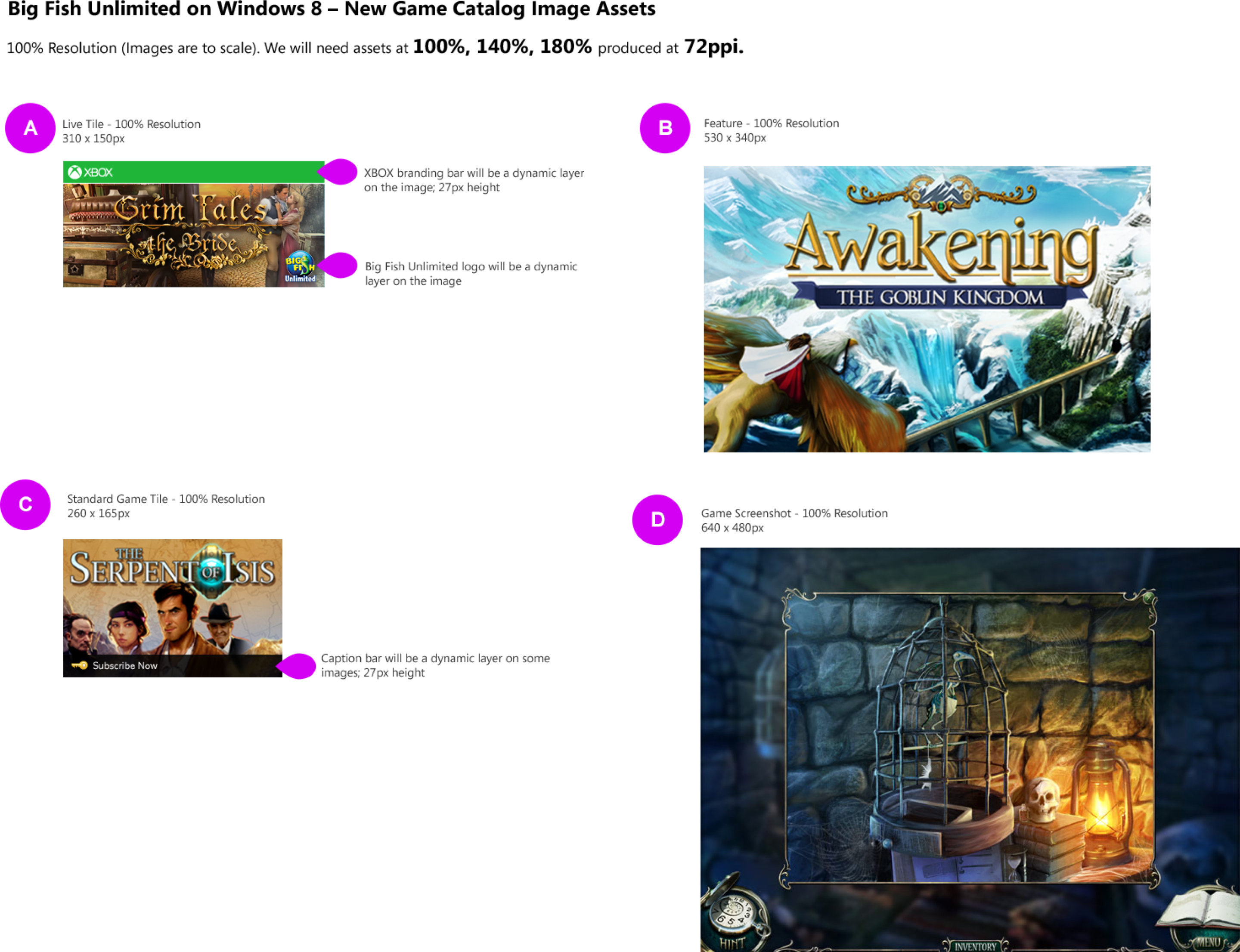
Since the turnaround time was very tight, it was imperative that we leverage existing game assets to limit any new efforts by the Game Production team.
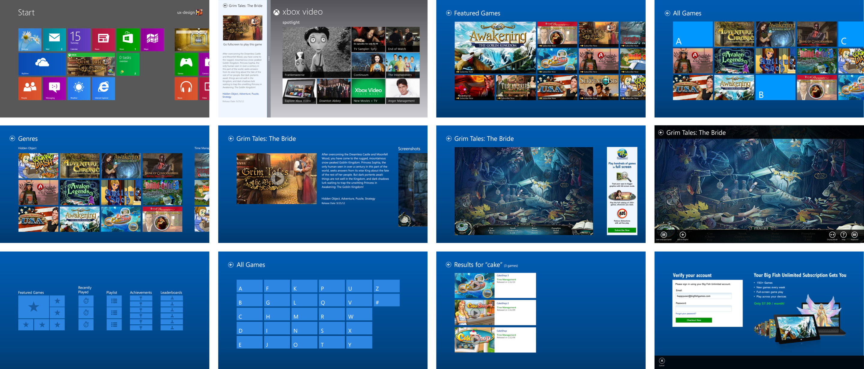
Although there was limited documentation to work from, there was enough guiding principles and pilot apps available to decipher some patterns in design. We were able to deliver the Big Fish Unlimited App on Microsoft Surface in time for launch. Key screen designs are shown here.
Big Fish Unlimited App on Roku
Like working on the Microsoft Surface, it was exciting to design for new platforms for the very first time.
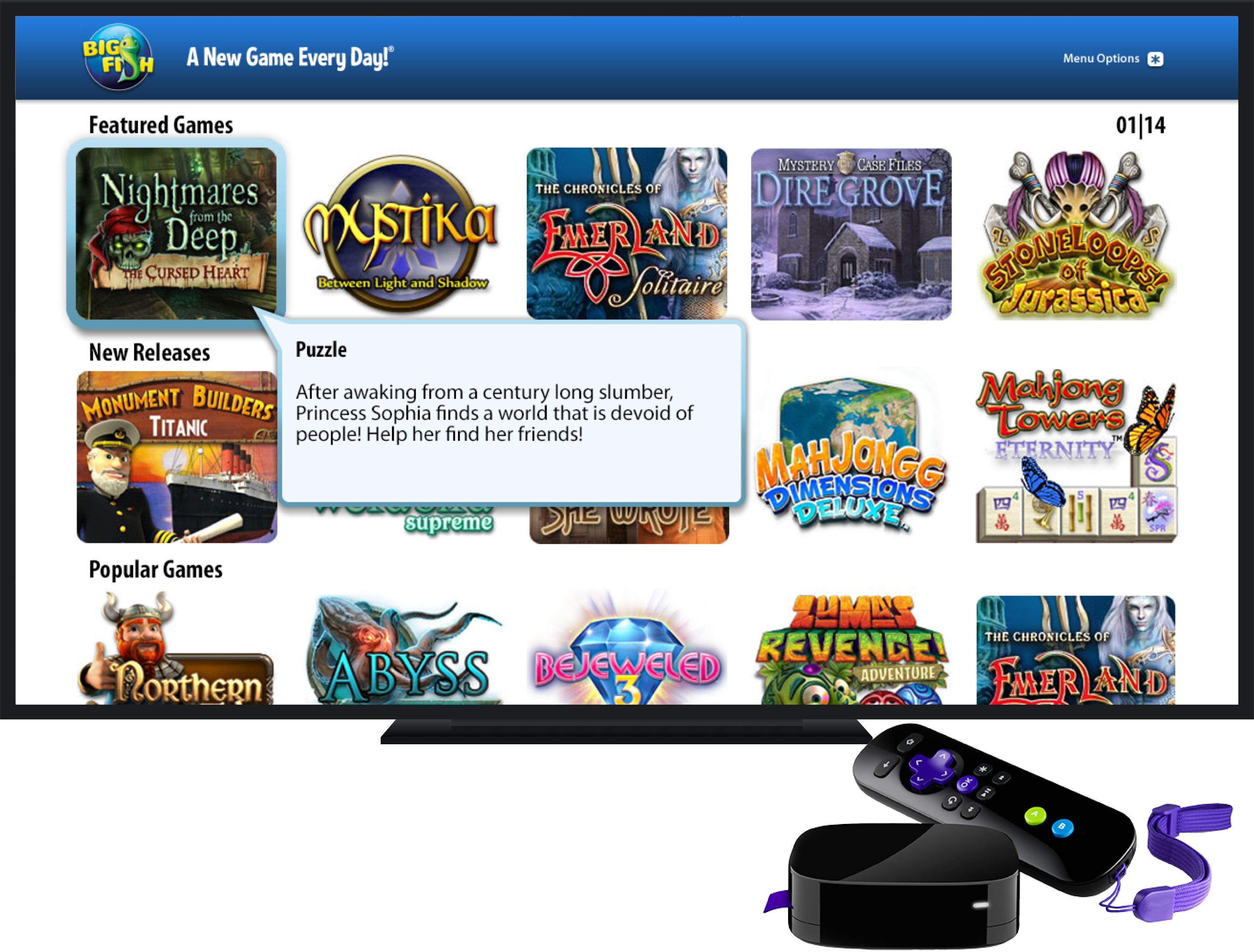

Early research started with getting a feel for the most established apps on the platform already – Netflix and Amazon Prime.
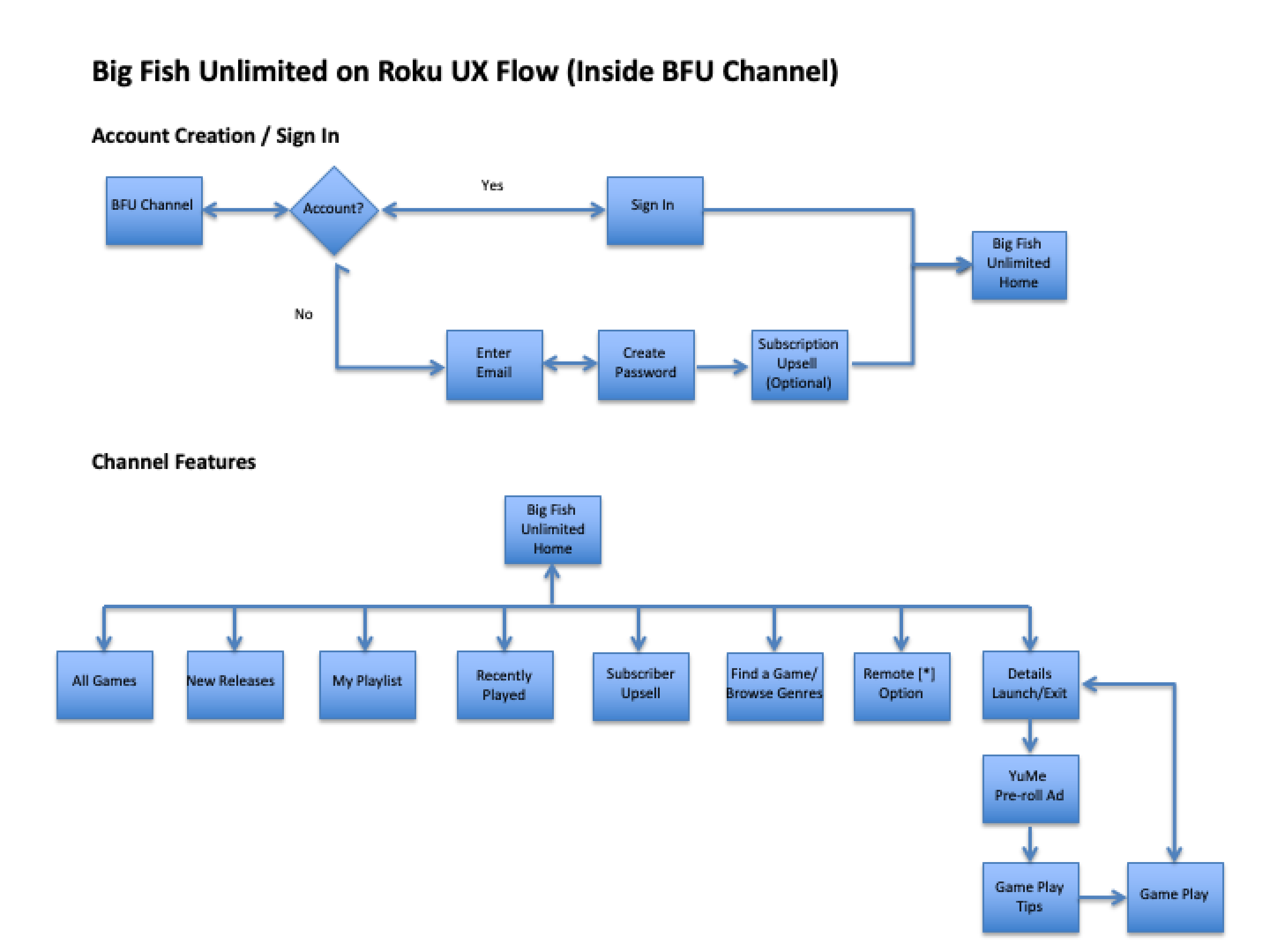
Simple information architecture was created to visualize the flows and screens that we were dealing with in the app.
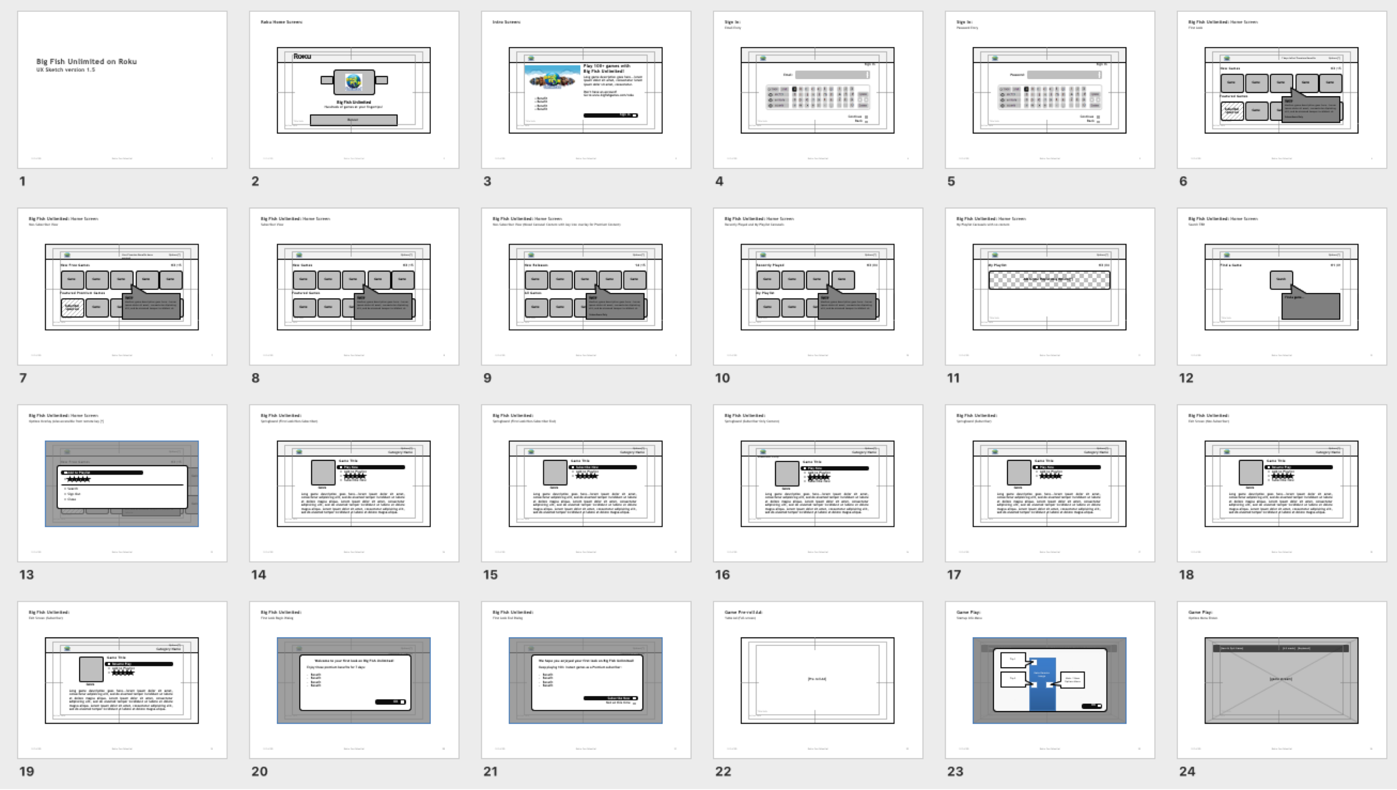
The Roku platform was very restrictive in what technically was possibly so we had to conform our designs into provided templates. However, that doesn’t mean we didn’t push the boundaries of what was possible.
Designs included screens for standard and high-definition resolution TVs as well as screens for these user types: Subscriber, Non-Subscriber, Free Trial, First-Time User, and Delinquent users.
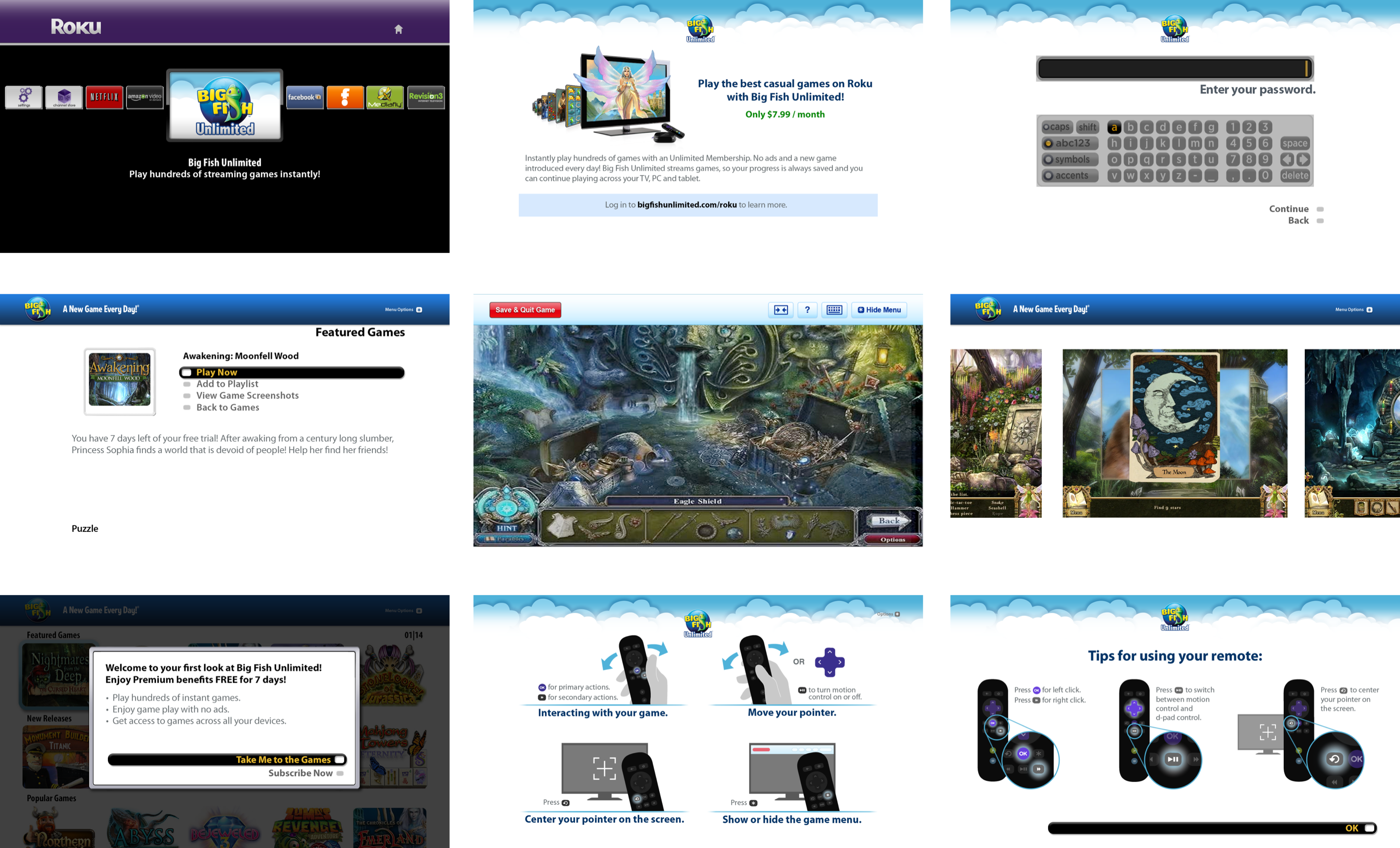
Illustrations were created to guide the user on how to use the programmable remote control for game play. Key screen designs are shown here.
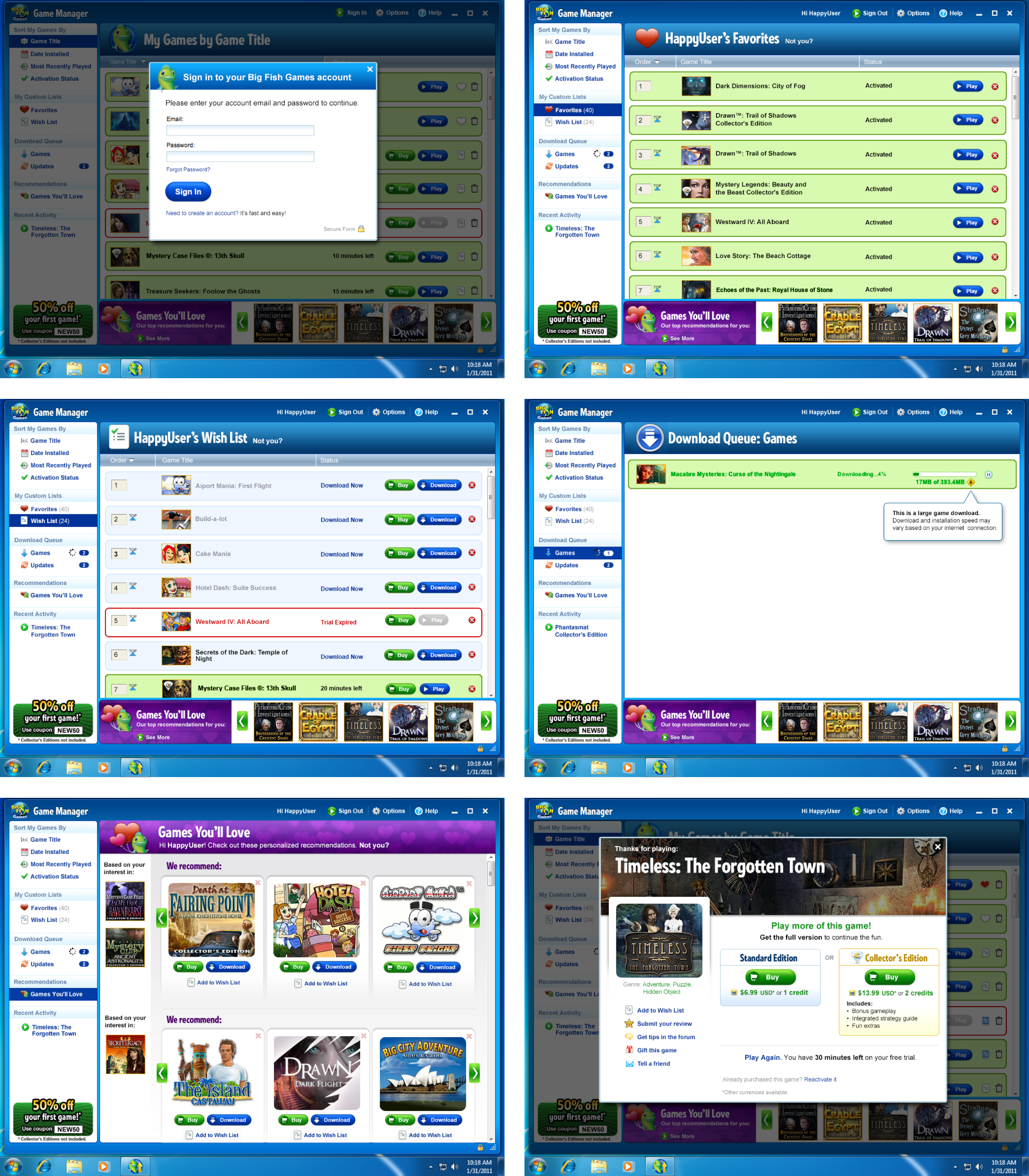
Game Manager Redesign
The primary game client for Big Fish customers had been iterated on throughout the years, but this was the largest release of features prioritized by user feedback. The Game Manager is the central client for managing all downloaded games either purchased or trialed from Big Fish Games.
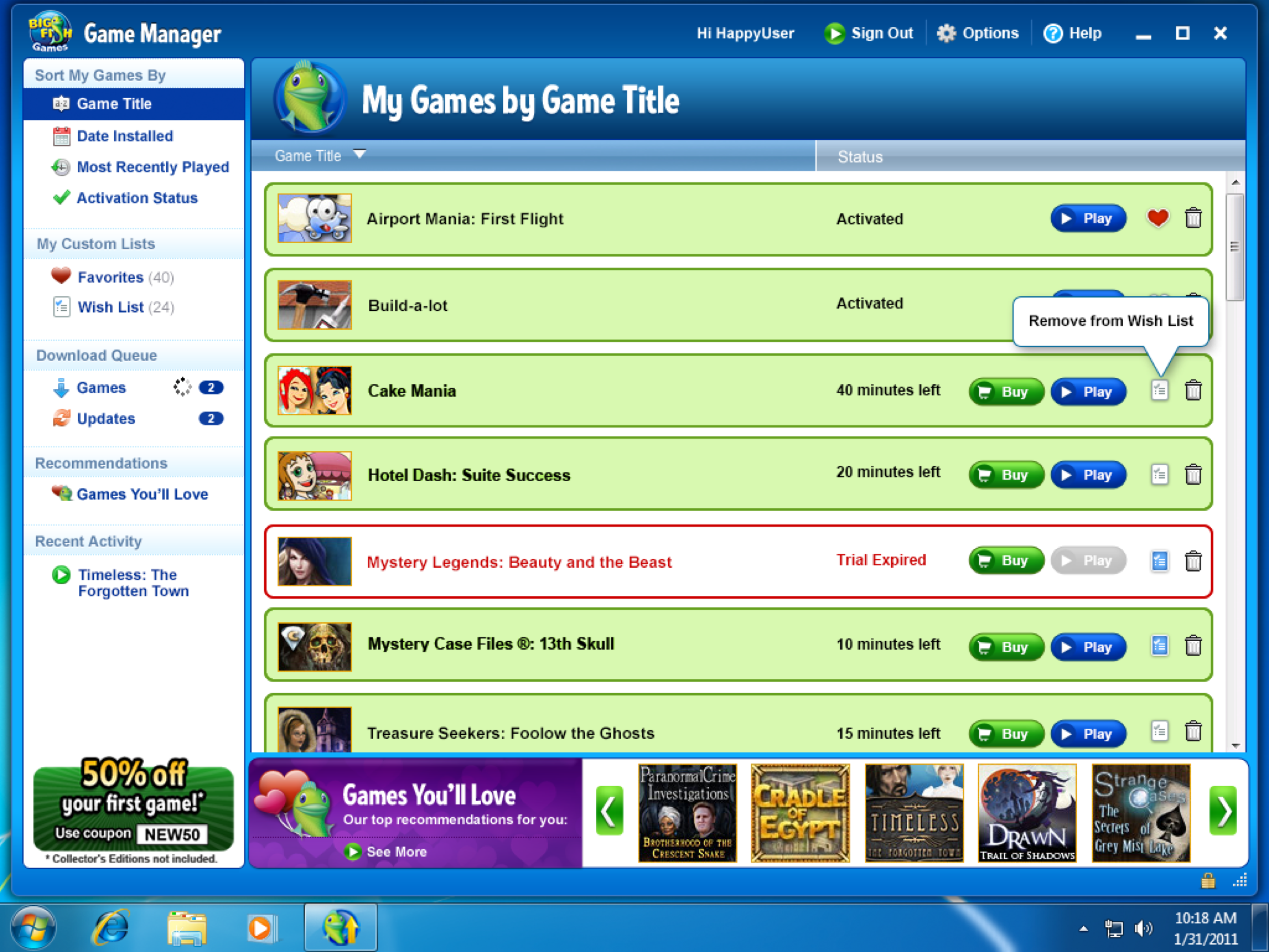
Features included:
- New authentication experience
- Integration of Games You’ll Love (an intelligent games recommendation engine)
- Favorites
- Wish List
- Game exit screen redesign
- Update to large file download experience
- Overall UI refresh
BigFishGames.com Concept Redesign
Problem and Vision
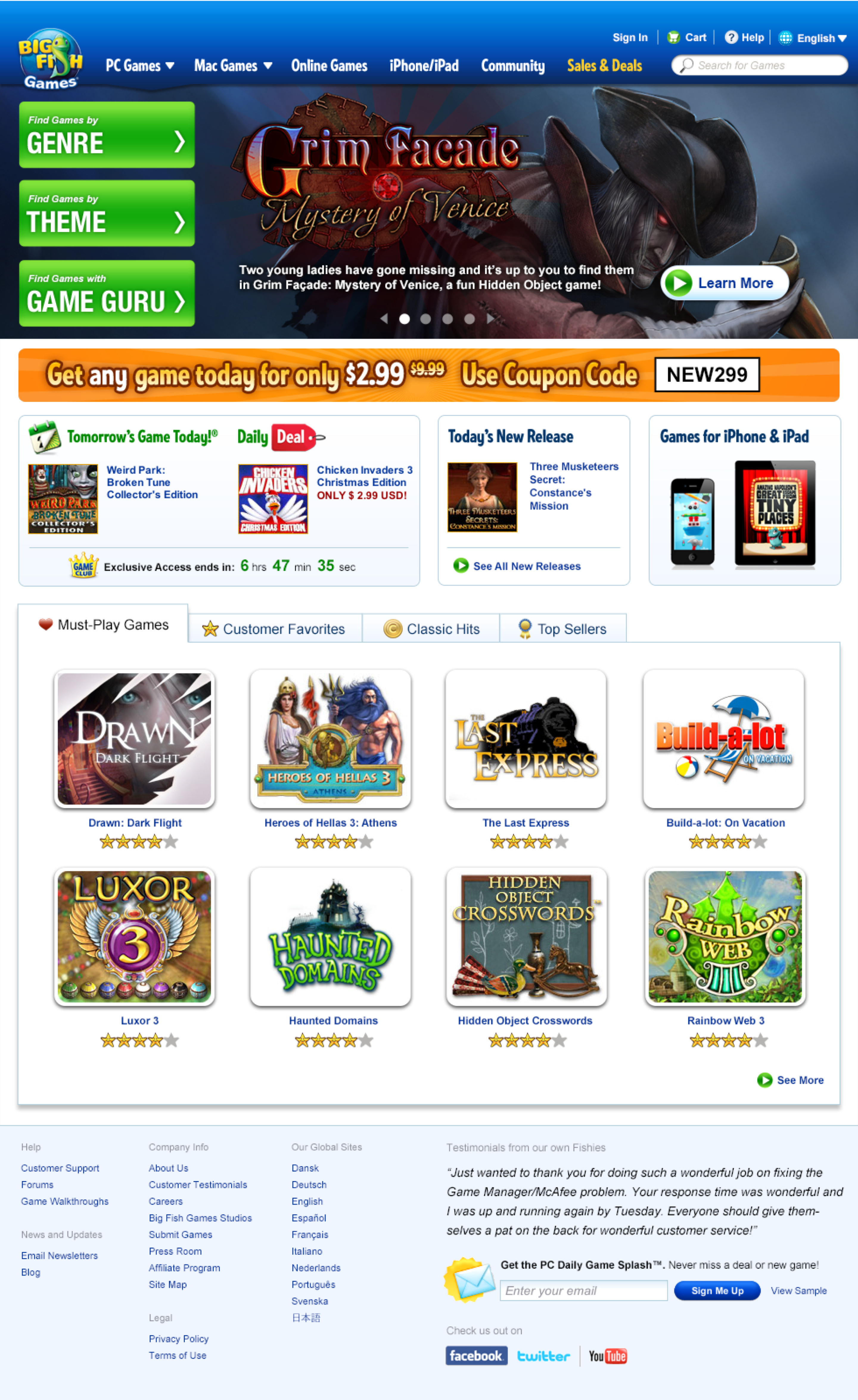
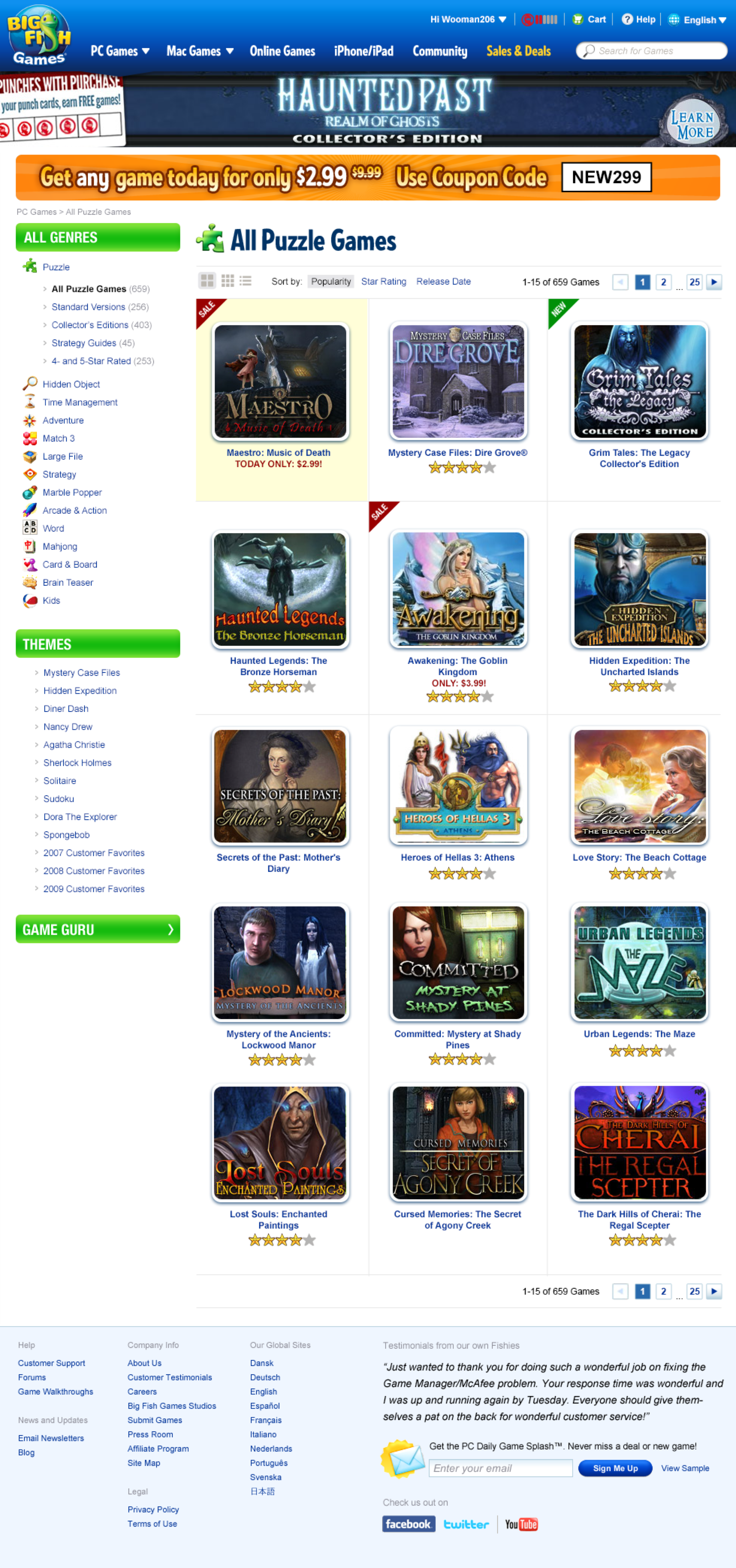
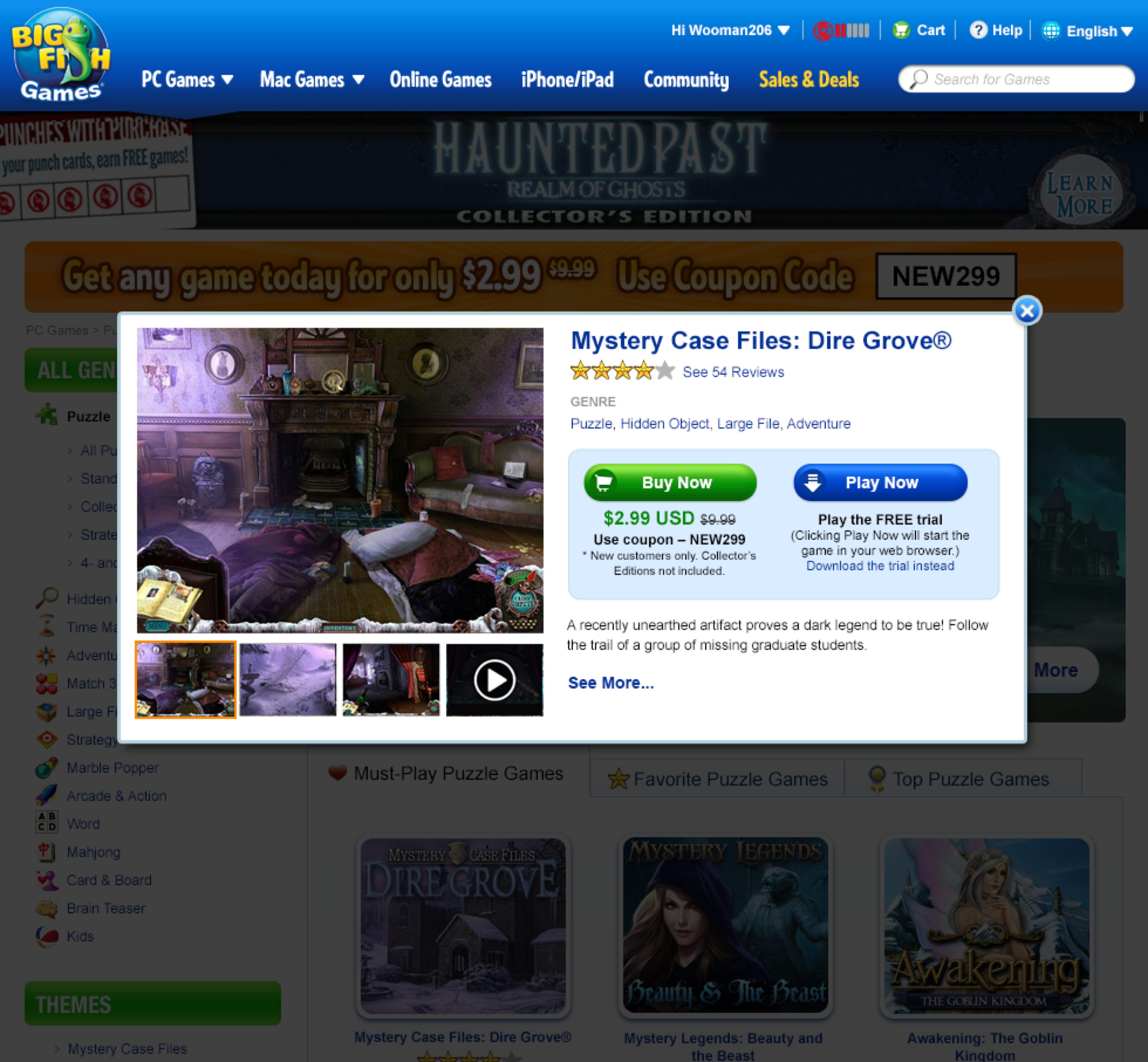
The website had not been updated for years, and in large part this was due to the customer base loving what was already there. This customer base was extremely loyal and vocal and did not hesitate to voice their opinions in the Big Fish Community Forum when they saw changes that they didn’t like.
However, the UX team knew we had to start thinking more holistically about the website experience, making sure that the site would be able to scale with the needs of the user and technology demands for years to come.
Goal
The UX team had an internal ‘bake-off’ to explore concepts that married future needs, UX enhancements, and customer expectations.
Big Sea Games Personas
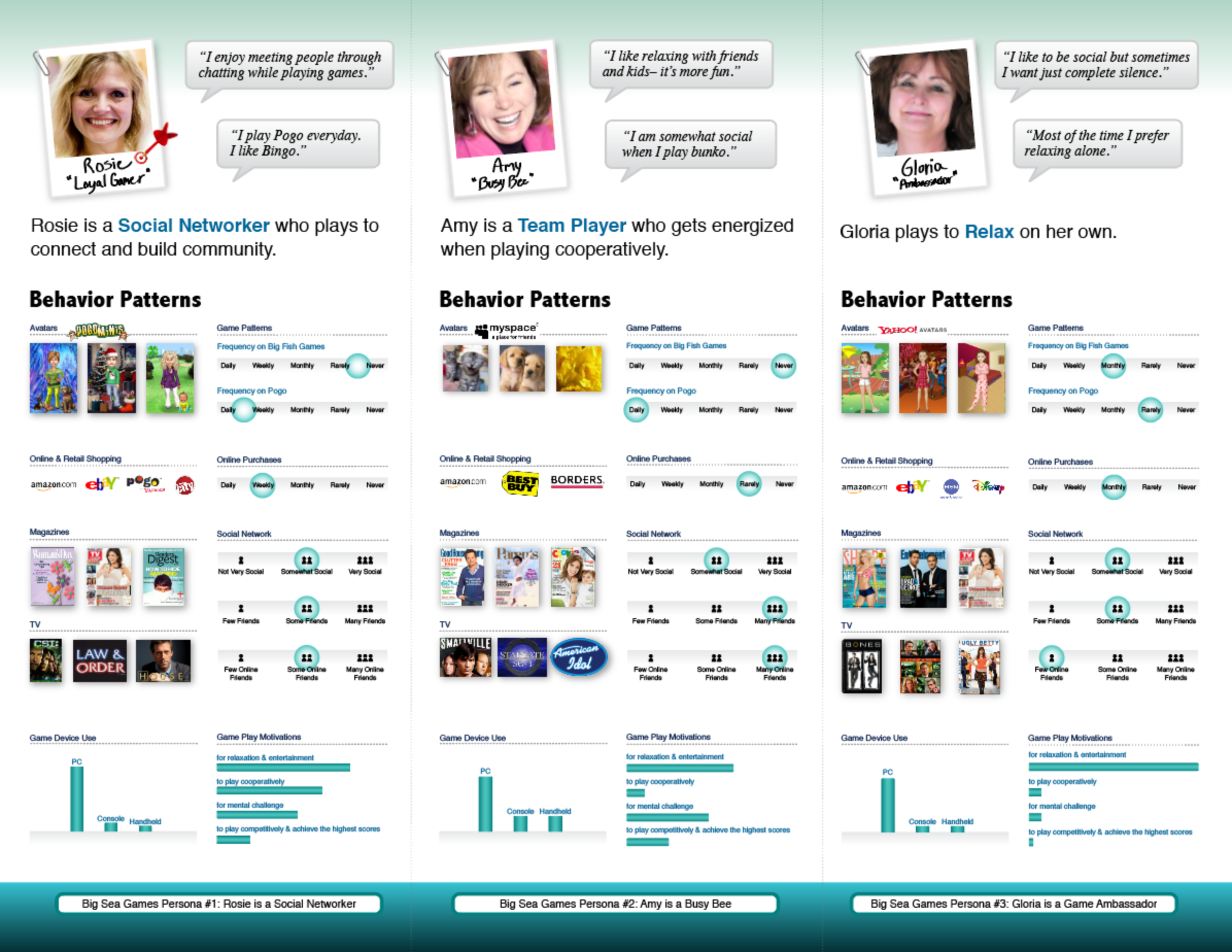
Using data gathered from the research team, I created personas for a pilot project called Big Sea Games, a Facebook gaming platform in 2009-2010. Applications included: posters, table tents, and digital distribution.
