Challenge
As one of largest health insurance companies in the northwest serving more than 2 million people, Premera Blue Cross was at risk of falling behind if their organization did not deliver a better digital customer experience. With a deadline approaching, they needed an outside perspective to define their future vision and help create internal alignment across their product team.
Solution
We led the Premera product team through a series of design workshops, gathering enough insights to aid in the design and prototype of a future, user-centered member portal concept. The output from the workshops was a detailed user scenario that wove the five core pillars of Premera’s product team into a single story. The design team used this story to design the concept and prototype which was used to get buy-in from Premera’s leadership team.
Outcomes
Our team aligned numerous stakeholder groups through design workshops and delivered an interactive prototype that inspired a future state for the member portal. The use of self-service design and display of contextual member benefits throughout the experience was used to reduce customer support call volumes which was later identified as top issues for customer support.
Role: Workshop facilitation, Strategy, Storytelling, Interaction Design, Prototyping
A Deeper Dive
Project Intake
Premera had an in-house UX research and design team, whom shared with us their quantitative and qualitative data that they routinely collected.
We took in about 20 different types of research content in about 20 hours time, sifting through the key pieces of information that would provide us the highest amount of value for our design workshop.
The most valuable piece of research that was provided during intake was the customers’ moment of truths. This allowed us to focus on certain areas of the user’s experience, prioritizing those over others with lesser impact. More on this later…
“Thank you UpTop for all of your efforts and partnership on this work. I am very pleased with the outcome and I’m looking forward to sharing this work internally with our business partners.”
– Director of Product Management & CX
Building Alignment
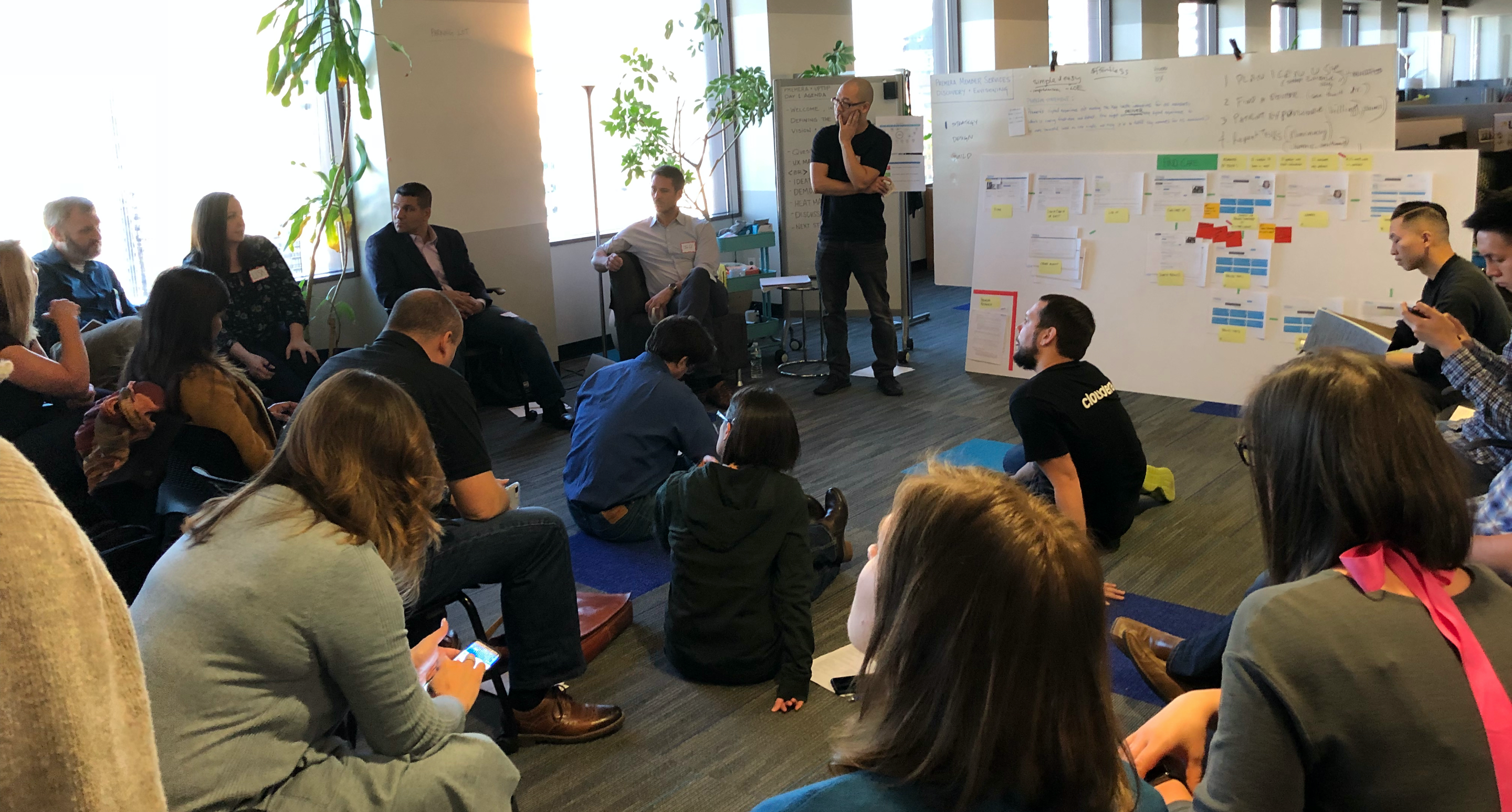
One of my designer’s and I facilitated four days of pre-planned workshop activities with more than twenty people across five product teams, including Premera’s UX research and design teams.
The following day’s agenda was modified after every workshop to adjust to our latest findings, with the intent to provide the highest impact for each activity.
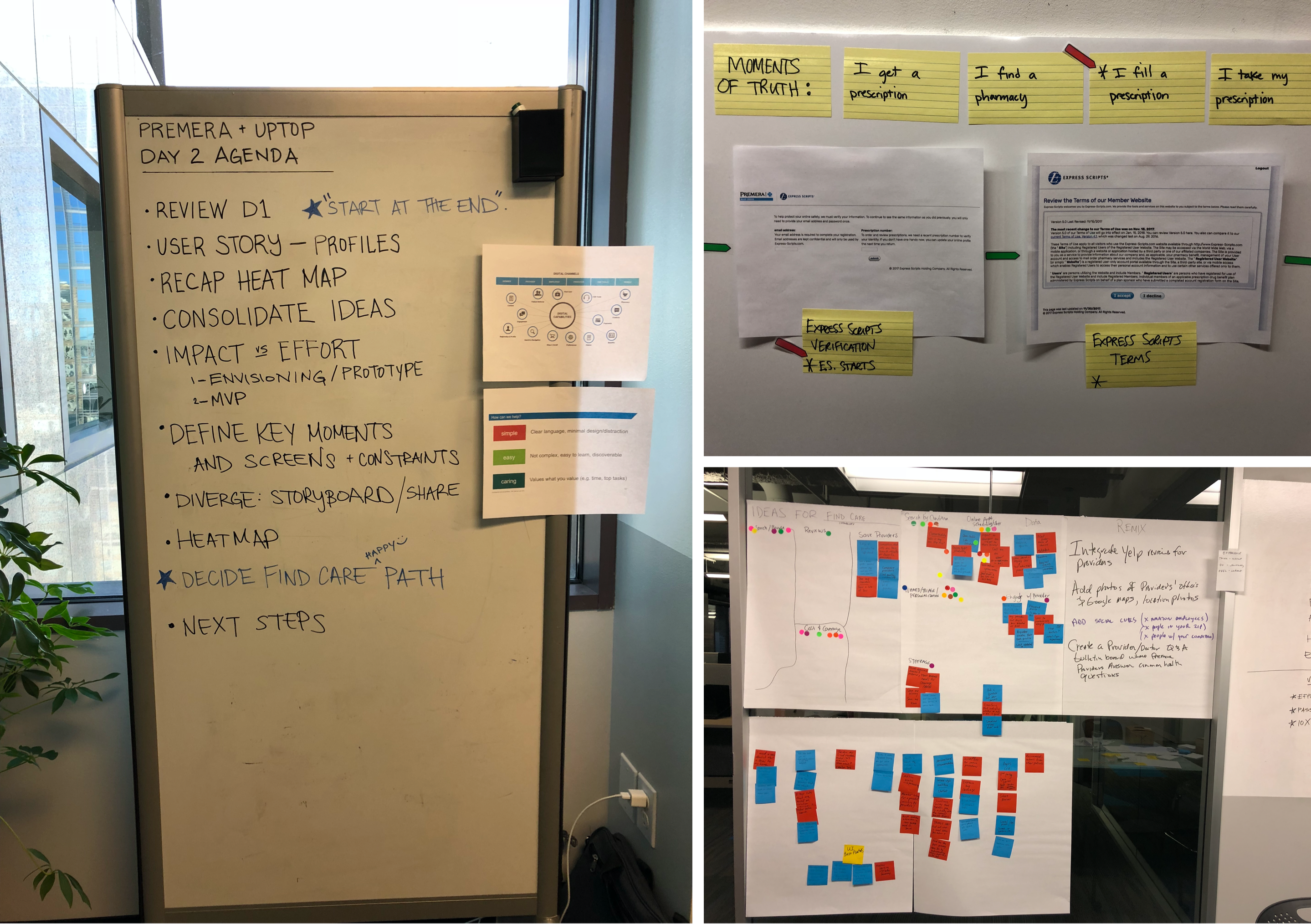
UX mapping of the existing experience was extremely helpful in forming a baseline for discussion, exposing current pitfalls and opportunities.
Throughout the process we exposed internal silos, healthy friction and disagreement. Even though they all shared a similar vision, they didn’t realize the extent of their customers’ pain points across their own ecosystem. Thinking ahead, how could we possibly represent so many stakeholders that were responsible for different parts of the customer’s journey?
The A-HA Moment!
Going back to the customer moment of truths, it dawned on us that what we needed was a story that would weave together those key moments of truth. Thus, a user scenario was created for a persona named Mary that walked her through signing up for a new healthcare plan, logging into the new member portal, finding a healthcare specialist, visiting the clinic, and renewing her prescription.
“Mary, a 43 year old school teacher, just relocated to a Seattle from Florida and is looking for a new health plan. Five years ago, she was diagnosed with a chronic, hypothyroid problem that requires a medication…”
While the moments of truth provided focus, the scenario provided the narrative that was needed for selling the vision back to executives in a way they could understand and empathize with.
Ideation
By the end of the workshop, empathy was built across different teams, people were able to share openly in the workshop setting, and product owners were empowered by leadership to let go of legacy systems and old ways of doing things.
As a group, we generated several concepts by splitting everyone up equally across disciplines into several small teams. Ideas were remixed and voted on. The top-rated, high impact ones were all incorporated into a final sketch which served as an outline of feature ideas for our story.
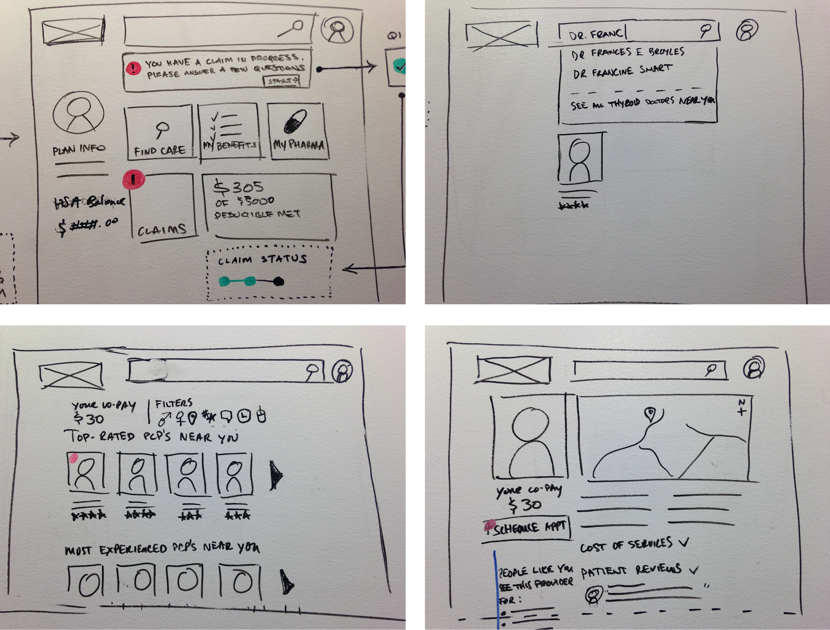
From here, my team went to work on trying to fit these ideas into a single narrative, weaving the customer moments of truth, across the five product areas of Shop & Enroll, Find Care, Benefits, Claims, and Pharmacy.
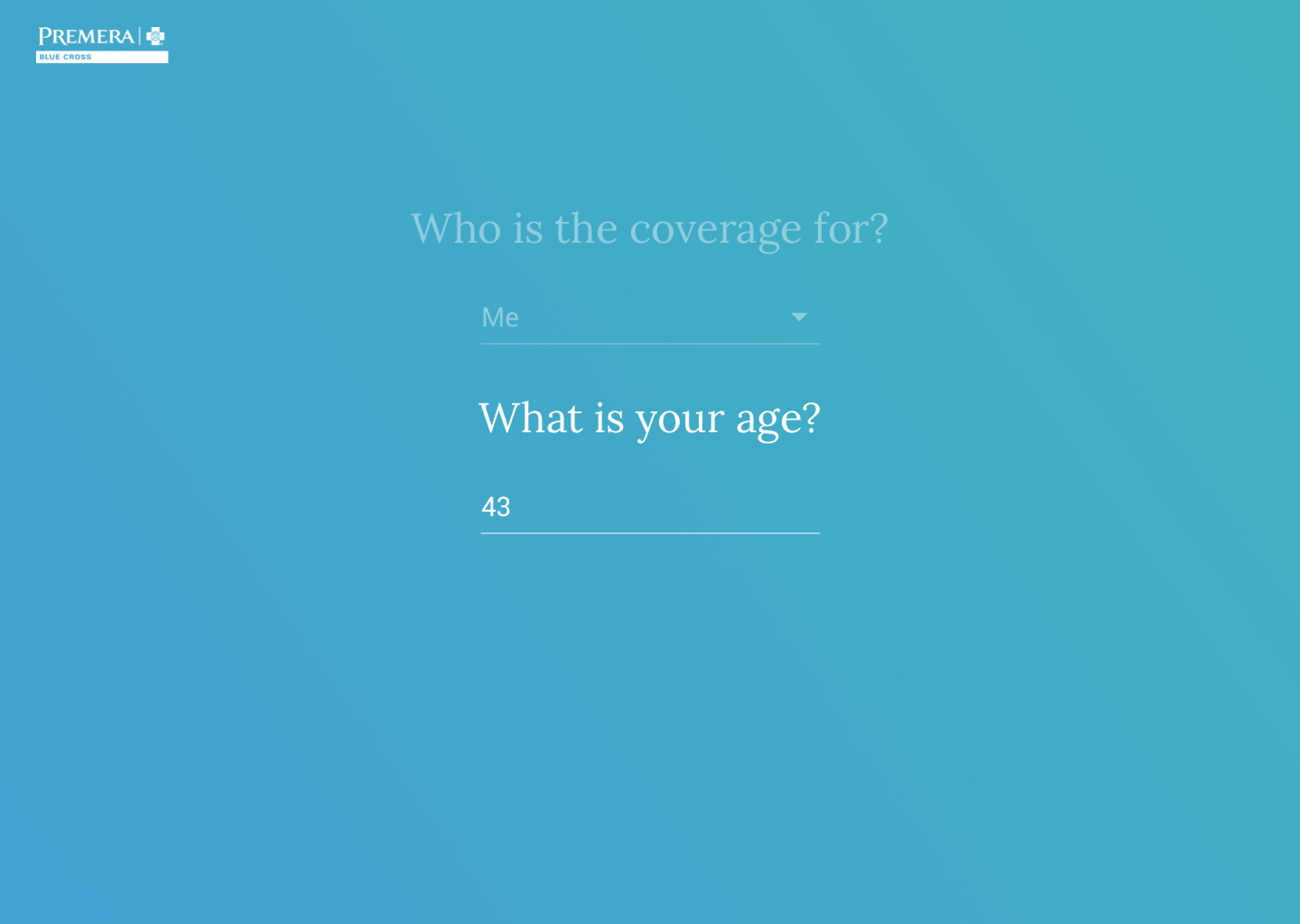 Simple, user-friendly, and conversational inputs led to the output of relevant healthcare plans to display to the user.
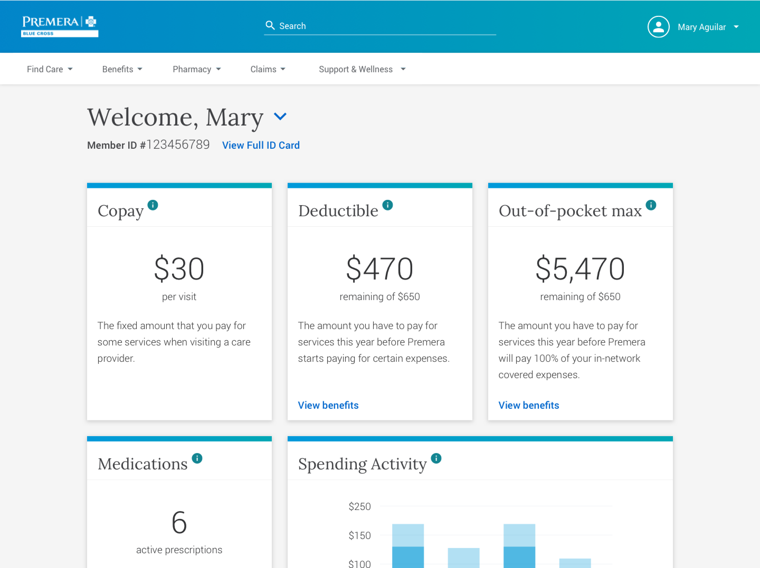
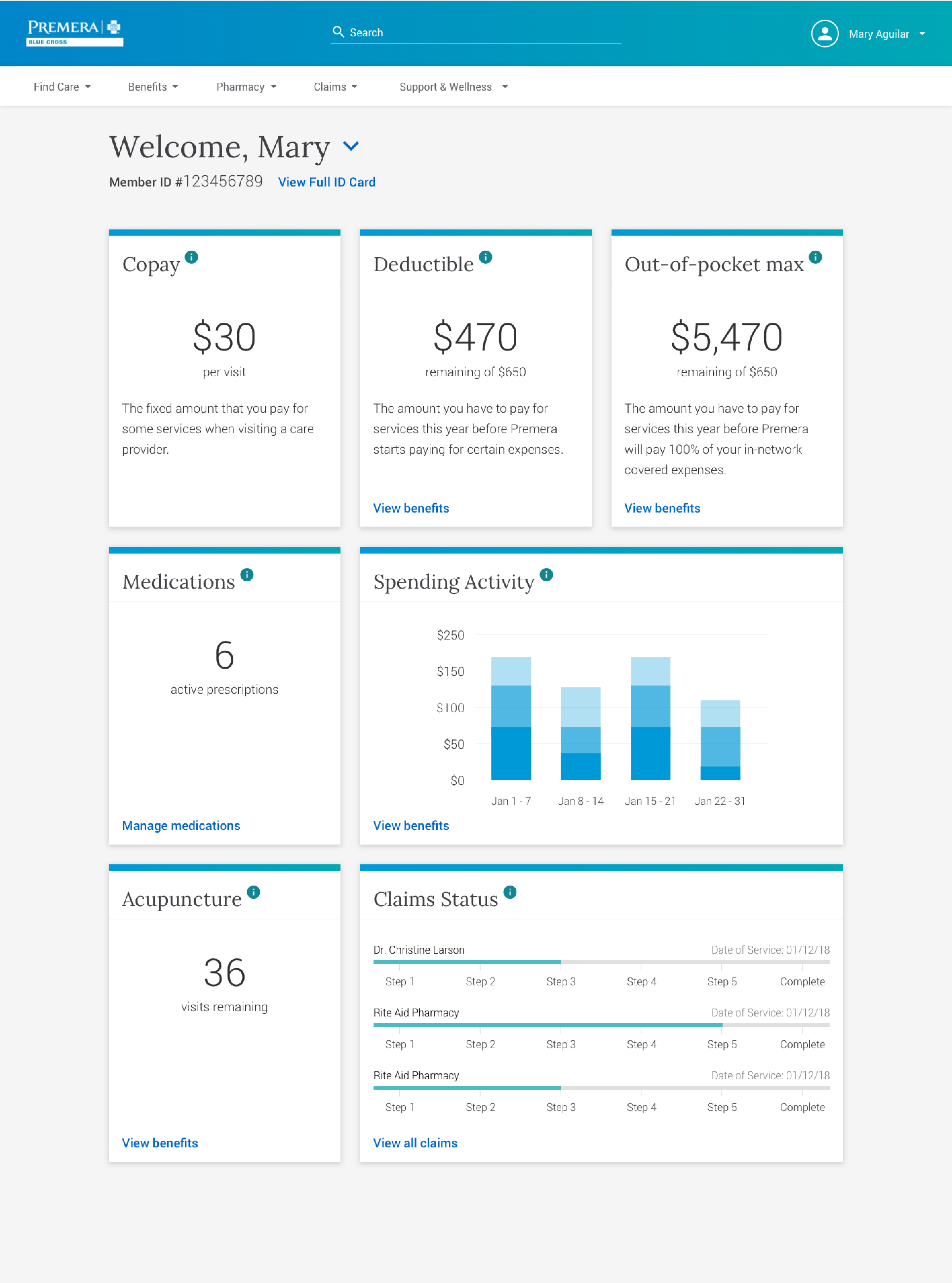 Existing member dashboard provides key customer data points that support their healthcare experience. A major emphasis was placed on self-service and providing contextual benefits and coverage information throughout the portal experience.
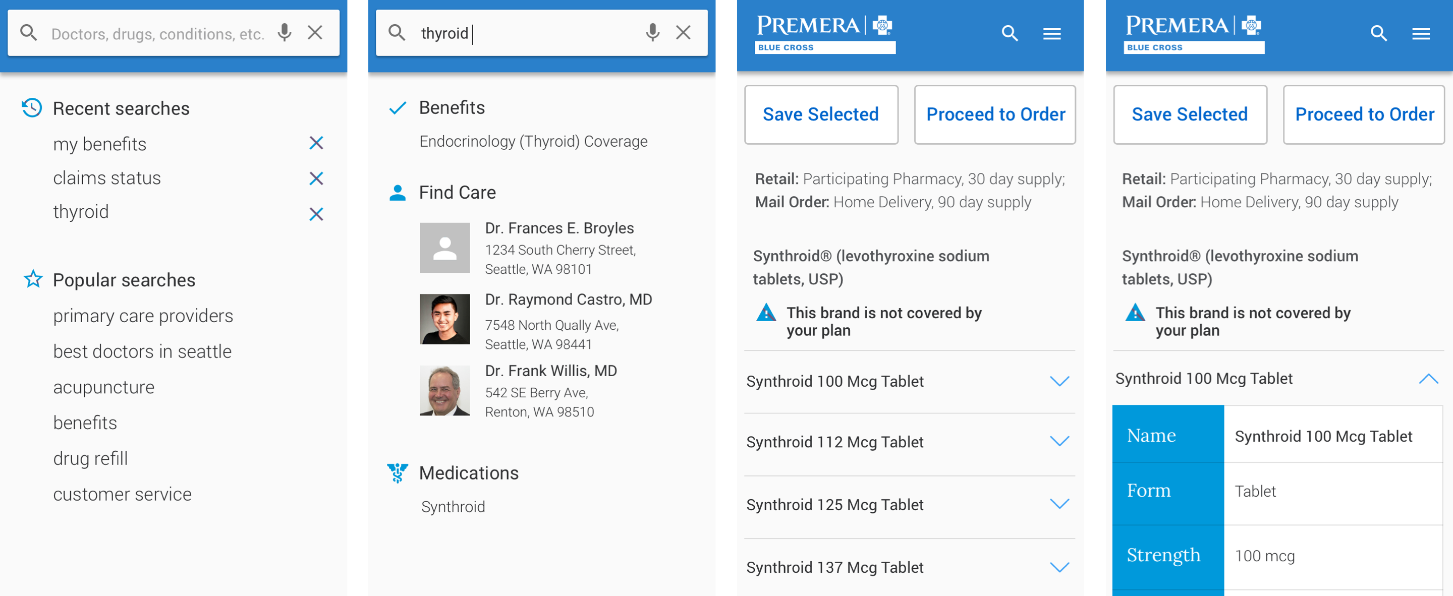
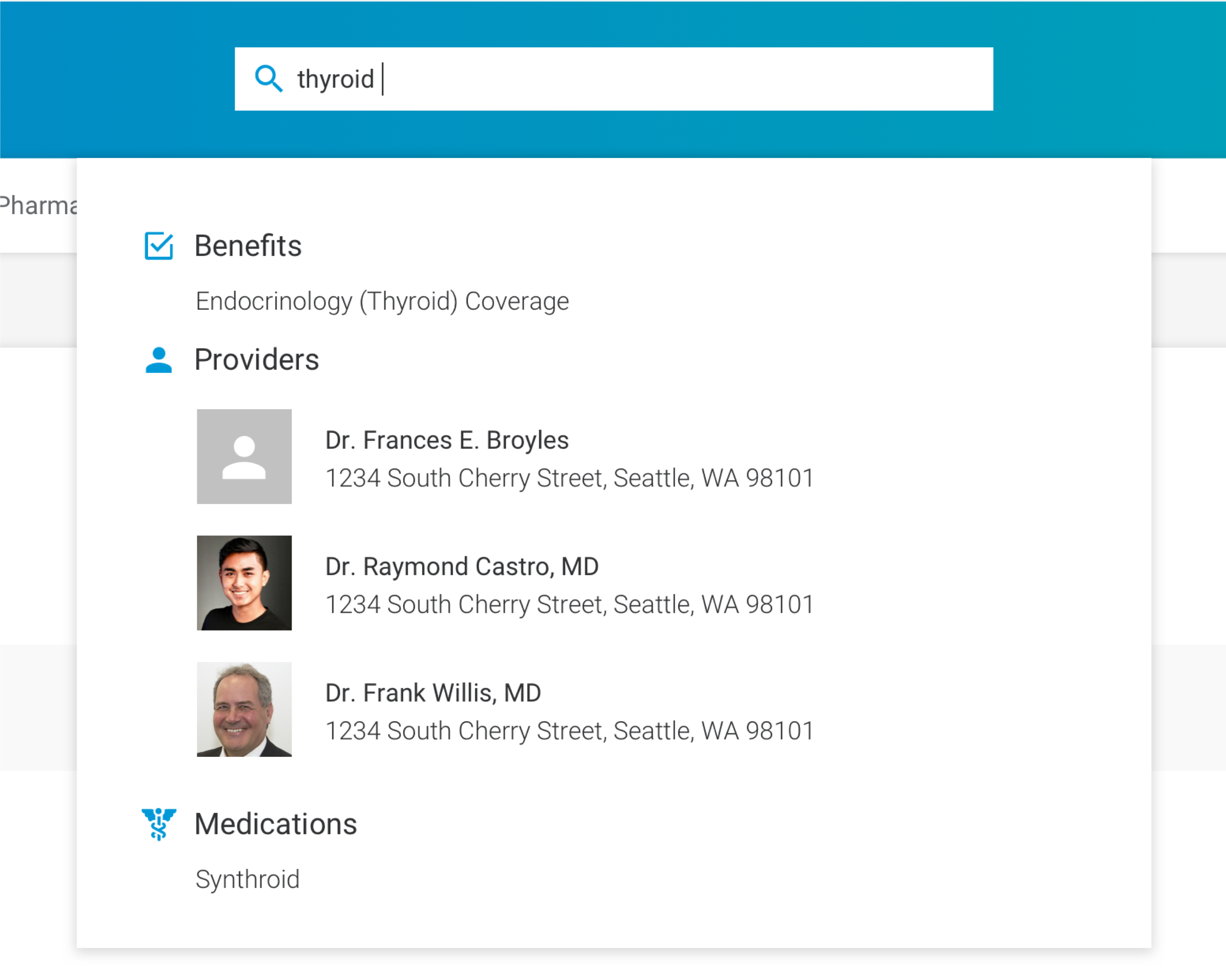 Intelligent, predictive search provides multiple data facets on the user’s search query.
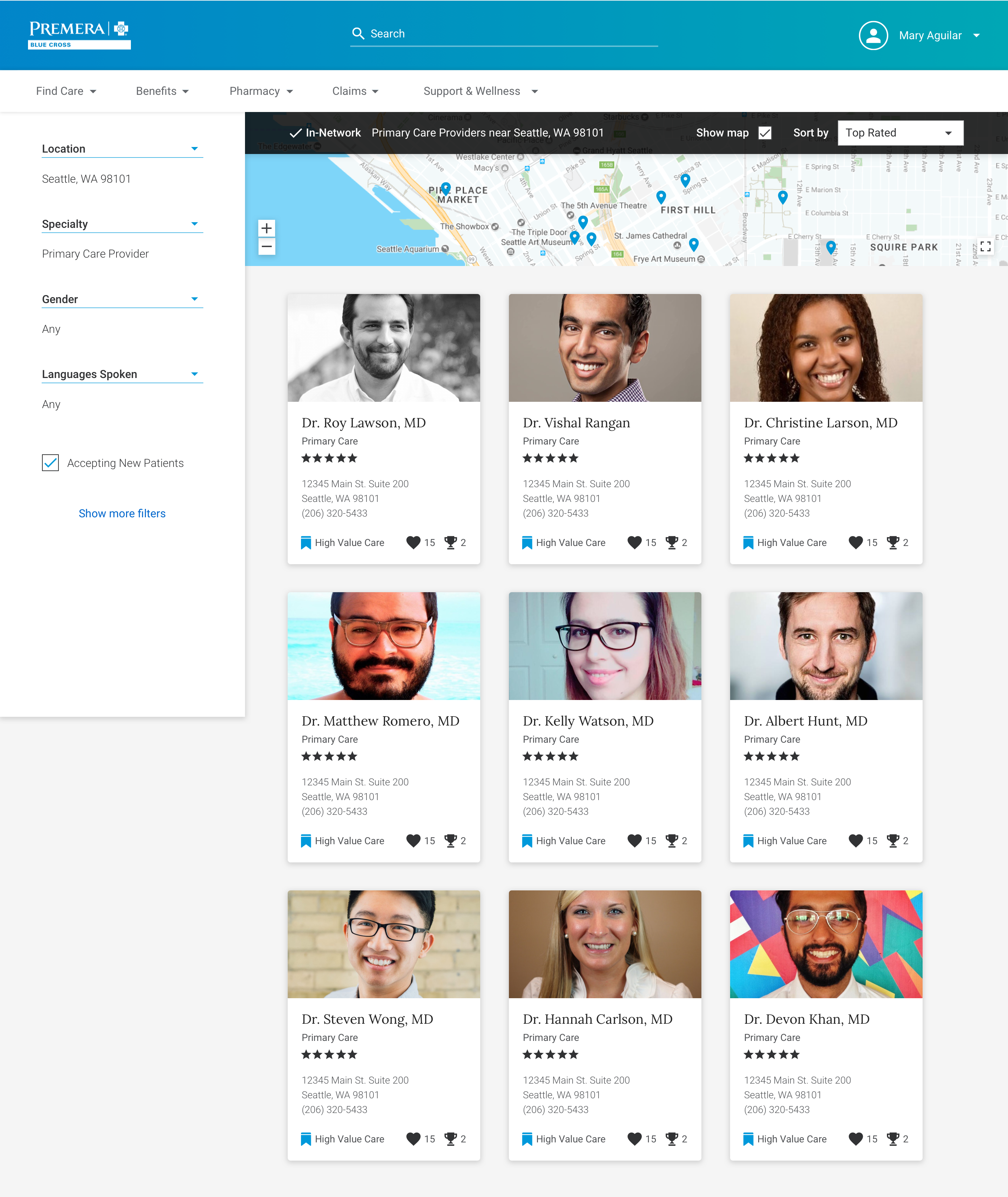 A friendly and familiar design pattern for results serves up meaningful criteria, such as ratings and certifications, along with traditional filters that help users compare options more easily.
Mobile search experience showing a patient looking up details on a drug, that your doctor has just prescribed, while on a doctor’s visit.
