Challenge
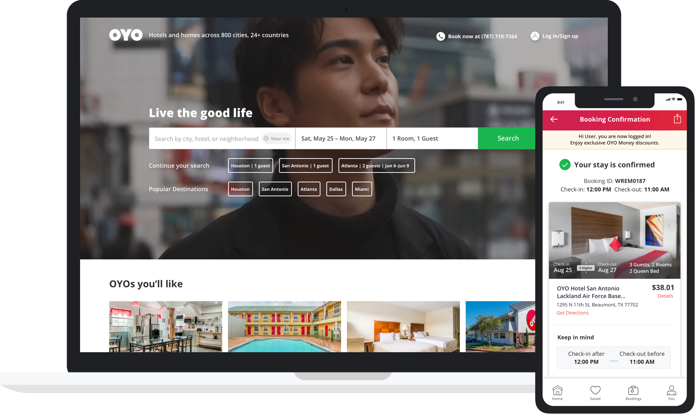
Redesign OYO’s key customer experience flows for their U.S. site, from search to booking, using a mobile-first approach. This included a new About page that required a storytelling approach by the client. The overall goal was to orient North American customers to the OYO brand, increase customer bookings by optimizing the user experience, and benchmarking against the likes of AirBnB, Expedia, and Booking.com.
Solution
We used a combination of standard UX practices and industry trends, working closely with the OYO product team to align within existing design standards and constraints. Our rapid design and iteration process allowed OYO to accelerate the design to dev process by visualizing options or concepts before finalizing.
Outcome
We helped OYO relaunch a mobile-first, responsive web experience for their U.S. site in approximately over four weeks.